National University
Rebranding and Unifying Two Online Academies into a Single Streamlined Site

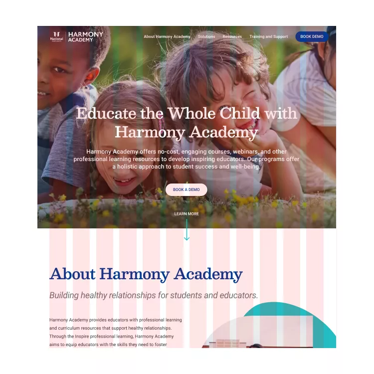
Harmony is an Academy at National University. They provide resources and programs focused on social and emotional learning. Previously there were two independent sites, Harmony SEL and Inspire Leading in Learning. Brick Factory was tasked with unifying the sites into a single website as well as rebranding the site.
Project Goals
Unify
Brick Factory worked with the Harmony team to merge two sites (Harmony SEL and Inspire Leading and Learning) into one.
Rebrand
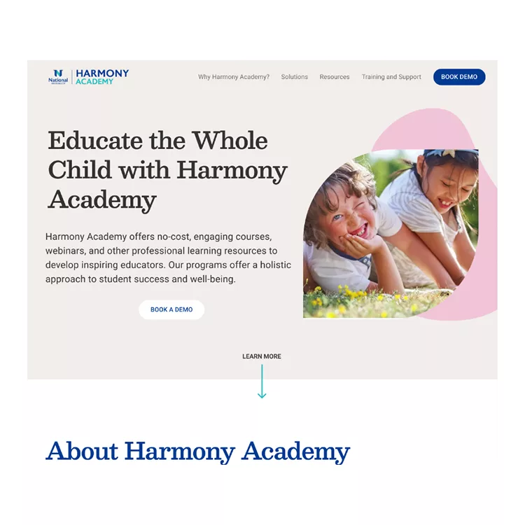
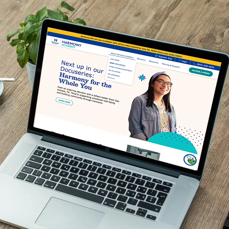
The original sites were not visually marketed towards Harmony’s target audience. A new design was proposed and implemented that spoke to families and teachers.
Scalable and Usable
An updated website backend and new foundation was built to support future e-commerce and make it easier for the Harmony team to maintain.
Process
Brick Factory worked with the Harmony team to perform a content audit and determine what content should be included in the merged site. Through this collaborative process, a new site map was created which would effectively combine two sites into one.
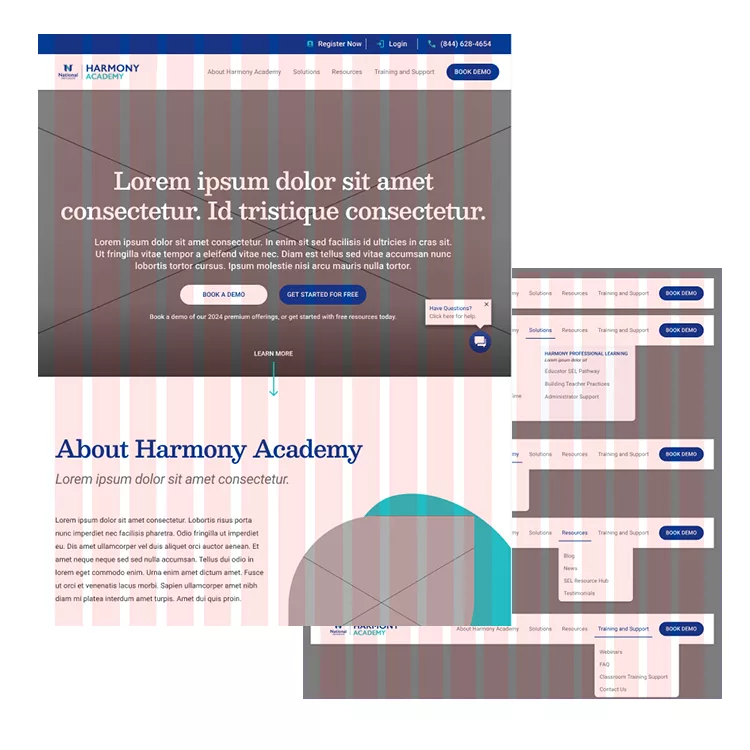
Once content was finalized, the NU creative team provided a homepage concept that the Brick Factory was able to use to create a style guide, the mobile version and secondary page templates that reflected the new branding.
Development work began while content was written or edited. The team starts with planning out Gutenberg blocks. Pages were put together and sent to the Harmony team for review. As the new pages were approved, the Brick Factory did final testing and added analytics.
Technology
An area of concern was the old WordPress content editor. A more user friendly content editor was desired by the client. The new site was built on WordPress and utilizes the Gutenberg editor. Custom blocks were created for the client’s use as well.
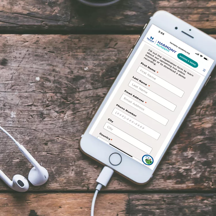
Custom field mapping was implemented to integrate with the academy’s lead system and esure data flowed smoothly between systems.
During the QA process, a tool called Userback was utilized to allow for a better feedback process. Reviewers were able to submit feedback directly through the site and collected in a single location, where fixes or changes could be reviewed and implemented efficiently.
Prior to launch, the site was tested on multiple devices and browsers, including mobile iOS and Android devices, Windows and Mac desktop computers, various tablets and browsers (Chrome, Firefox, Edge and Safari) to ensure a uniform experience.
Results
More users engaged with the site.
Increase in form submissions.
Overall website traffic increase.
